 simpler
Camera and colour
A good image is first of all a good shot, and then a good development, as photographers say. The Camera panel is your lens; Colour and exposure, in the Rendering panel, is your darkroom.
The Camera panel#
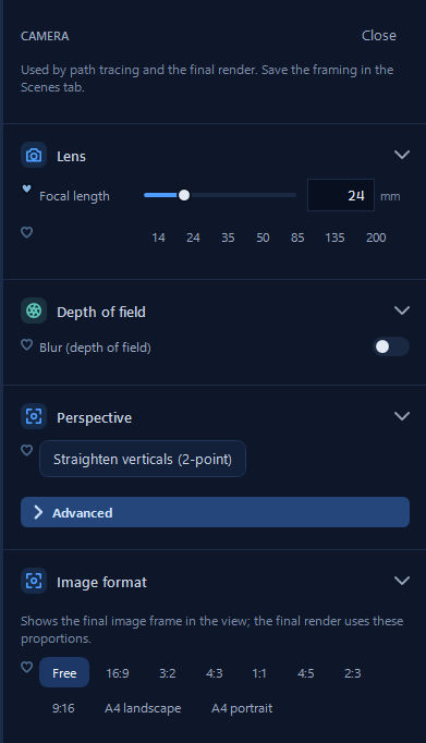
Open it with the aperture button in the toolbar. These settings are used by path tracing and the final render. When you find a framing you like, save it in the Scenes tab, together with the time of day and the weather, so you can always come back to it.
Choosing the lens#
The Focal length is the most important choice of a shot, and the quick values 14, 24, 35, 50, 85, 135 and 200 mm let you try them in a second. Short focal lengths, 14–24 mm, are wide angles: they show a whole room or a whole square, but stretch what is at the edges, so use them with care. 35–50 mm is close to what our eyes see and gives the most natural images: when in doubt, start here. Long focal lengths, 85–200 mm, isolate a detail and compress the distances: the mountains behind a village look closer and more imposing, which is why landscape photographers love them.
Depth of field#
Blur (depth of field) makes what is in front of and behind the point in focus softly blurred, as a real camera does with a wide aperture. It is the simplest way to tell the viewer where to look: a cup in focus with the kitchen blurred behind it, a product on a table with the room melting away.
Straight verticals#
When you look up at a building, its vertical lines converge and the building seems to fall backwards. Architecture photographers correct this with special lenses, and Straighten verticals (2-point) does the same: the verticals stay parallel even when the camera looks up or down. Turn it on for every façade and every interior with tall walls; it is one of the details that make an architectural image look professional.
Image format#
The format sets the proportions of the final image: Free, 16:9, 3:2, 4:3, 1:1, 4:5, 2:3, 9:16, A4 landscape or portrait. The view shows the frame, so while you compose you see exactly what will end up in the picture. Choose it before framing: a vertical 4:5 and a wide 16:9 ask for different compositions.
For Instagram choose 4:5; for a phone story 9:16; for a printed sheet the A4 formats, then a print size in the final render.
Colour and exposure#
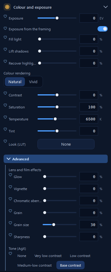
Once the light is right, the image still needs to be developed, and that happens in the last section of the Rendering panel. The look, the tone adjustments and the lens effects act on the finished picture: they change at once, without restarting the path tracing.
Exposure works in EV as in a camera: +1 doubles the light, −1 halves it. Even better, Exposure from the framing measures the light of what you are framing, like a camera's light meter, and is perfect for interiors, scenes in shadow and night shots. If the windows of an interior are burnt white or the shadows are too deep, Recover highlights brings back the sky outside and Lift shadows and Fill light open the dark corners, gently.
Colour rendering can be Natural or Vivid. Contrast and Saturation do what you expect; Temperature makes the whole image warmer or colder, and Tint corrects a green or magenta cast. Look (LUT) applies a ready colour grading, like a film or a photo filter: Simpler has its own looks and you can import yours. Right-click a look ▸ Add to favourites to keep the ones you use most at hand.
Lens and film effects#
Under Advanced you find the imperfections of real cameras, which paradoxically make a render more believable: Glow around bright lights, Vignette that darkens the corners, Chromatic aberration at the edges, Grain like film. Use them lightly: a hint of vignette and grain makes a render look like a photograph, too much makes it look old.
Tone (AgX)#
The tone decides how the very bright and very dark parts of the light are compressed into the image. Base contrast, the default, works for most scenes. With lower contrasts, down to Very low contrast, the deep shadows of a forest or of an interior stay readable; higher contrasts give punchier, more dramatic images.
An interior in daylight: 24 mm, Straighten verticals (2-point) on, Exposure from the framing on, Recover highlights at 30% so the windows are not burnt, Base contrast. The room is bright and the garden outside is still visible through the windows.